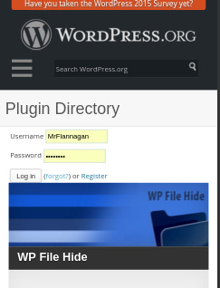
I’ve been visiting the WordPress plugin repository a lot lately and, specifically, on my iPhone for a lot of that action. For a site as refined as WordPress, it almost hurts to see this on my visits. The login form sits RIGHT on the border of the image below it. This is such a small detail that’s easy to fix and it’s a high traffic area of the site. Why does it go on this way? It’s been so since I started visiting regularly a couple months ago.
These small details are important in web design. Tell me that three years ago and I’d have said, “whatever.” But, as I’ve grown in this industry you realize the importance of items like this, especially on well put together web sites. It’s a small detail, but it’s glaringly obvious.
Maybe they have a reason for it to be that way /shrug.


You know, you could just offer to fix it: https://make.wordpress.org/meta/
Hmmmmmm, looks like I’m gonna have to do that.